Thursday 30 April 2009

Shades & Tones


It is really difficult to describe a shade. Let's take these 'stays'. Teal? Petrol? Powder? Bright? Baby? All these descriptions are subjective and it depends on which part you are looking at! I've worked with colour for roughly thirty years and I still wouldn't count on trying to memorize one. A picture would help - but even that has its limitations as printers still have difficulty duplicating shades and printing onto different mediums. Computer monitors are even worse at portraying what you want to show, using CYMK, RGB, etc is O.K, but when different monitors are not set the same, you are back to square one. Where you put things, ( RED or BLUE), can make it even worse!
In the past, 'Rich' colours meant exactly what it said. You were wealthy enough to have the cloth put twice through the dye bath OR had enough to afford expensive dyes. Presuming, of course, that you could ignore 'sumptuary laws', which were enforced in certain periods of history. What we call 'Sad' shades were worn by the poorer sections of society and were usually duller and more easily available from local sources. How people went on the past with dyes, pigments and paint is still a subject of much debate, conjecture and experimentation. I tell you all this because Jorge has revived his blog on medieval colour & painting here. and his web album is here. Both, well worth a visit.
His lovely work, I think, helps to prove that the world in past times wasn't quite as dull as some people imagine.

Tuesday 28 April 2009

The Devil is in the Detail......

I saw a good sign yesterday outside a shop. It read 'Nearly Organic Rhubarb', which had me quite confused. It was almost as good as one I saw some time ago which said 'Crocuses - Last Week!'
It is so easy to get it wrong, to make signs confusing - and at worst misleading. We spend a lot of time trying to get the text on our website right and it bothers us if anyone misreads it. It makes us spend a lot of time checking the wording and saying to ourselves "O.K, what's it not saying that it should"? or "What's it saying that could be misinterpreted?"
Try these:-
95th Rifleman officers Dolman, rifle green cloth, black worsted braid, and silver metal buttons, made in your size, and using the standard frogging, lined with black cotton.
Seems to be O.K? We see a lot like this and for the price, they can be fairly good. What's it not saying? Well I don't see any interlining, which may cause the weight of the buttons/braid to drag down. How much braid? Is it wool? What's 'standard frogging' anyway? How many buttons? Are they Ball, Half ball or flat? Where are the velvet collar and cuffs? Any Austrian knots? We call this sort of thing 'Weasel words' - because if you ask for it made properly, the price suddenly doubles!
Here's an alternative;-
Made from the finest grade, Rifle Green, melton wool, it is interlined internally to support the extravagant amount of wool worsted russia braid and 80 silver plated, ball buttons. The collar and cuffs are of black velvet. Braided round shoulders. Bespoke made. Austrian knots to side back. Braided all round hem, cuffs and front of collar. Lined in good quality linen. Buttons embedded into main cloth.
This actually goes too far the other way. If someone is very short, or young, the chances are that 80 buttons won't be used as the braiding would be too close together. But which one would you read? Which one would you want? In the past, I have ordered things that were what I wanted them to be - not what was on offer. The Devil is in the detail. What I can say is that here you get what you ask for. We go the extra mile, (that's 1.609343994 kilometres), to get it right!

BTW. The above is just an example. The only misreading we've had lately, was on shoe buckles!

Thursday 23 April 2009

For that Windy Old Weather.....

CALASH
Dictionary: ca·las
h (kə-lăsh') pronunciation also ca·lèche (-lĕsh')n.
1. A light carriage with two or four low wheels and a collapsible top.
2. A top for this or a similar carriage.

3. A woman's folding bonnet of the late 18th century.
[French calèche, from German Kalesche, from Czech kolesa, from pl. of kolo, koles-, wheel, from Old Church Slavonic.]

As you can tell from the pictures it's not a light carriage with four wheels and a collapsible top but it WAS named after this.
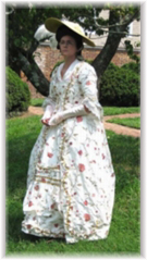
The bow at the top front unties and forms 2 strings which the lady would hold onto to pull the hat forward and keep it in place in windy weather. This one has been reproduced from a late 18th C original found in America and is entirely hand made. The outer is made from silk taffeta and is drawn over canes to form the ridges. The inside is lined with white twill silk. I'd also have a slight quibble with the dates as the Calash went out of use about 1830, making it an 18th AND 19th Century bonnet. This makes it a problem where to put it in the web albums. The solution we normally take is to place it in the album where it makes its first appearance, so you'll find this in 'Various(1700-1820)'. There are now 25 Albums and it's becoming a bit of a drag to keep splitting them up to make them faster at downloading. Nevertheless, it is giving us a good reference file (!) and if we weren't so successful, I suppose it wouldn't be a problem....
Come to think of it - I'd rather have the problem!

Tuesday 7 April 2009

Not a Standard Tabard!..

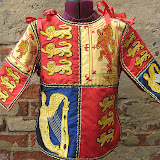
Heralds Tabard (Child size)

We've just completed a tiny order for Kensington Palace in London. I say a tiny order because it was only 15" across and made for a six/seven year old, though it certainly took some time to complete.
When I first saw the photos of the original, I thought it was a bit odd and the lions on it were not the sleek lion/leopard beasts that you're used to seeing on Royal Standards and Tabards, but more like 'pug dogs' with a mane! The Irish harp was also very different to the normal interpretation. Never the less, we were requested to copy the original and we did - after requesting 'flat' photos to take away perspective issues.
Then there were the scaling problems to overcome. Getting a Lion Rampant to fit in a 3" space and still look like same and NOT like a red blob is not an easy task.
It was completed with a mixed technique of applique and embroidery on to quartered silk panels and took over a quarter of a million stitches. Someone in the office said that one of the panels should be bright red. "Why?" we asked innocently. "Because it has a quarter of vermillion stitches"! Groans - and a quick exit!
Anyway click on the picture to see more photos.

When was the original made? Well, it's not that clear. Gini has suggested about 1900, due to the sewing techniques. What was it for? They didn't have educational 'try-on' then. Perhaps Royal children played 'Heralds and Pursuivants' instead of 'Cowboys and Indians'?